Project Summary
The goal of this project was to identify a research question of interest that will guide the rest of the analysis and investigate that research question using data visualization techniques. I decided to explore the following question: “Based on the ICU admissions source, how do adult patients with AIDS compare to those with Leukemia vary by ethnicity?”
Data
Intensive Care Units (ICUs) often lack verified medical histories for incoming patients. A patient in distress or a patient who is brought in confused or unresponsive may not be able to provide information about chronic conditions such as heart disease, injuries, or diabetes. Knowledge about chronic conditions can inform clinical decisions about patient care and ultimately improve patient outcomes. The dataset in excel had a lot of information and I decided to clean it and focus only on the variables I was interested in. For more information about the dataset, click here.
Insights
Comparison of patients with AIDS or Leukemia
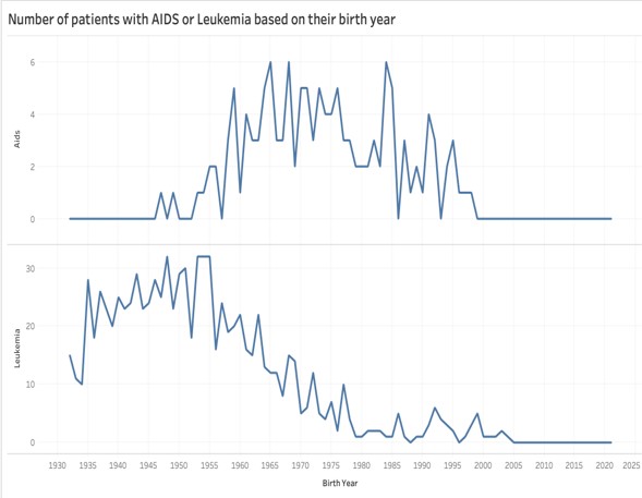
The first visualization presents a time series graph contrasting the trends of AIDS and Leukemia. As we can see, most people that were born between 1960 to 1985 are diagnosed with AIDS, while most of those with Leukemia were born between 1935 to 1960. A possible explanation for the different time periods in which each disease peaked can be related to a lack of education, and the social stigma that accompanies AIDS carriers.
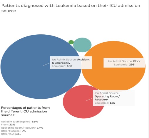
Diagnosis of Leukemia based on ICU admission source
The second visualization shows patients diagnosed with Leukemia based on their ICU admission source. Specifically, we can observe that 97% of the patients are entering the ICU through three sources. The first source is Accident & Emergency with 51%, followed by Floors with 32% and Operating Room/Recovery with 14%.
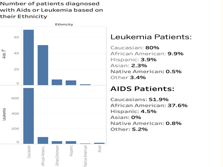
Comparison of patients based on their Ethnicity
This visualization is used to compare the two different groups of patients, considering their ethnicity. We have noteworthy high percentages for Caucasians in both Leukemia and Aids patients with 80% and 51.9% respectively.
Conclusion
One of the biggest takeaways of this visualization project is that the Admission & Emergency and Floor are the main ICU admission source for both AIDS and Leukemia patients. We see a tremendous difference in the percentage of Caucasian compared to other races. This can be connected with the white privilege debate, suggesting a disparity in the quality of health care delivered to Caucasian and non-Caucasians. Lastly, the time series plot has shown that a potential reason for the huge time difference between the two diseases is the social stigma and lack of education for AIDS patients.