Project Summary
The goal of this project was to get an in-depth understanding of my LinkedIn connections, impressions, and engagement. In the last few months, I have been more active with creating meaningful connections, posting, and content that has increased my visibility on the platform. LinkedIn is one of the most widely used professional networking platforms, with over 700 million users worldwide. As more businesses shift towards digital use, having a strong LinkedIn presence has become increasingly important. Providing a LinkedIn metrics dashboard, it’s a great way to create a quick project that can showcase your analytical skillset.
Data
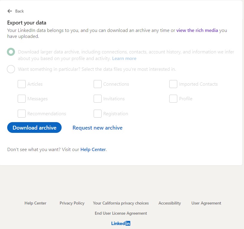
Every person with a LinkedIn account can access this data. You log in to your LinkedIn account, go to “Settings & Privacy”, “Data privacy”, “Get a copy of your data”, and “Download archive”. It might take up to 24 hours to get your data and you will receive an email from LinkedIn when it’s ready. It is a large zip folder that contains CSV files such as Messages, Invitations, Learning, etc. I specifically focused on the “Connections” and “Content” CSV files. I have provided a screenshot below of where you will get the data.
Analysis & Insights
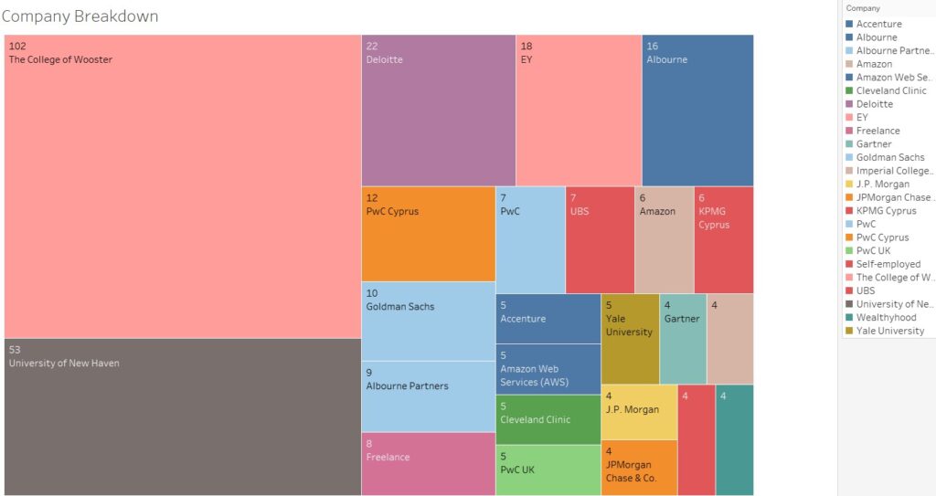
This is a tree map that shows which companies my connections are from. Not surprisingly, the top two are the universities where I pursued my graduate and undergraduate studies. It also makes sense to have a lot of connections from Albourne America and Albourne Partners, where I was a Marketing Analytics Intern this past summer.
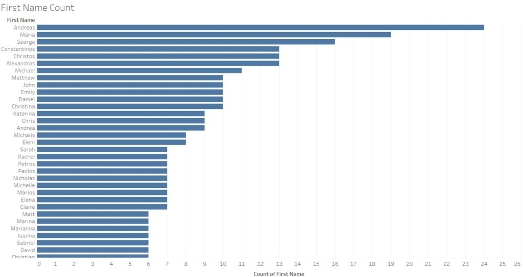
This is super interesting since I wasn’t aware that I’m connected with so many people with the same name as mine! As a Cypriot native, I have a lot of connections that are names of Greek origin. Living and studying in the USA for the last 6 years have expanded my network, with names such as “Matthew”, “John”, and “Daniel” coming up with 10. A straightforward sidebar chart that can give you immediate insights!

This line chart shows the running sum of my connections over the last 90 days. I had to make some changes to the data and play around with the range of the dates and the type of variables, but it’s fairly easy to create as well.
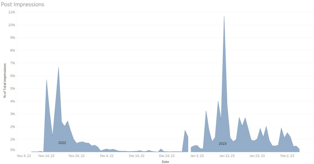
By far my favorite visualization! It shows the Percentage total of Impressions of my posts in the last 90 days. From January 2023, I decided that I will be more active by posting at least twice a week. This is clearly portrayed in the visualization! Great insight that I wasn’t aware of. You can view the dashboard at my Tableau profile by clicking here
Conclusion
Creating a LinkedIn Metrics Dashboard for my portfolio analytics website has provided me with valuable insights into my LinkedIn performance and helped me understand how the platform works. It’s a great project, especially for beginners, to create a simple, quick visualization project and explore their account activity including profile views, connections, and content engagement rates. For all of my aspiring analytics professionals, it’s a project I highly recommend including in your portfolio website!