Project Summary
I had the pleasure to be part of the men’s soccer team both as a player and as a volunteer data analyst. When my collegiate soccer career was over, I wanted to stay involved with the team from another position. In collaboration with a colleague, Ilias Giannakopoulos, we were the volunteer data analysts for the Spring 2022 & Fall 2022 seasons for the varsity men’s soccer team. One of the key benefits of having a men’s soccer data analyst is the ability to gain a deeper understanding of players and team performance. This includes analyzing data on things like ball possession, passes completed, shots on goal, and goals scored. The analyst can then use this information to identify areas for improvement and help the team adjust its game strategy. And that was our main goal: To create visuals and assist the coaching staff based on the needs of the team.
Data
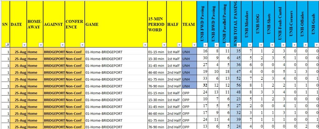
As volunteer data analysts, we did not have the software to track the data of the team automatically. We tracked the data manually by watching the games live or on tape. Each of us was responsible for tracking the data for either UNH or the opponent. Prior to creating our own database in Excel for Data Entry, we spent time talking with the coaching staff about what type of data they needed. Below you can see an example from the game against the University of Bridgeport on how the data was entered for each game.
Analysis & Insights
Quick analysis after a game
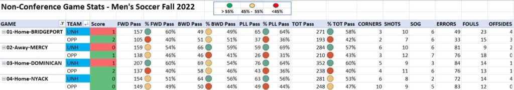
We provided a report to the coaching staff after the end of every game. It was usually provided through a quick analysis of a pivot table that we used to automate the collection process of the data. Pivot tables are important for calculating percentages and statistics because they provide an efficient way to summarize and analyze data. Having the ability to quickly calculate percentages and statistics, can help you make more informed decisions based on your data. As you can see in the screenshot below, we were able to identify patterns and trends that might not be immediately obvious in the raw data. This example is specific to the Non-Conference games of the Fall 2022 season.
In-depth reports using Tableau
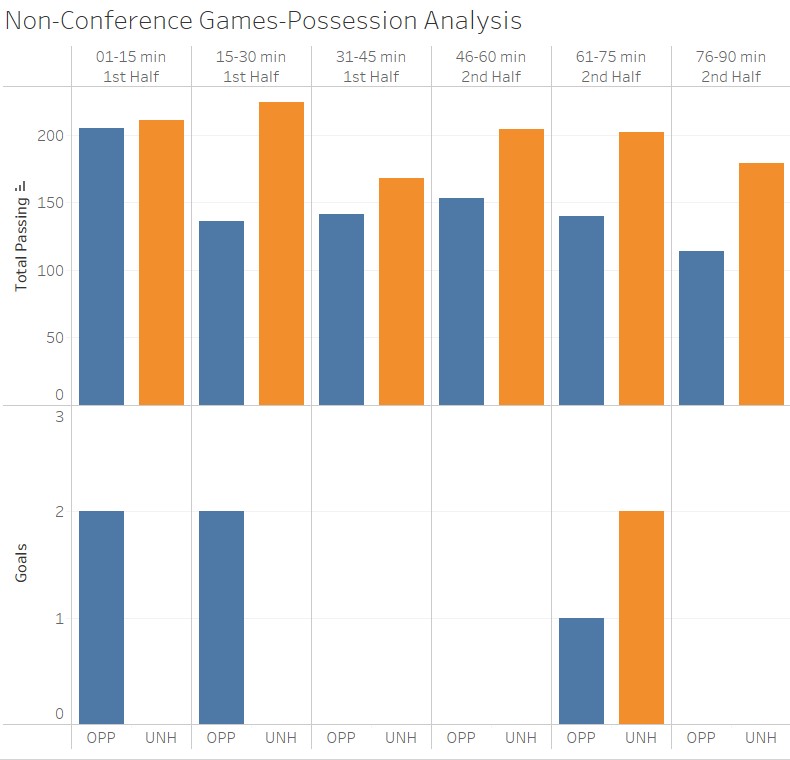
With the use of Tableau, we were able to identify more sophisticated trends. In soccer, possession is typically used as a proxy to measure dominance. In theory, the team that has the ball the most dictates the flow of the game and creates more opportunities to score and win. As you can see in the visualization below, this is not always the case. The team has been possessing the ball very well but struggled to score. This visualization breaks down the possession in a 15-minute span and compares it with when the goals were scored.
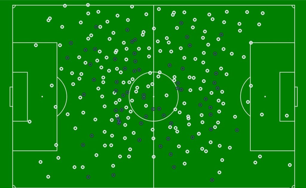
It is also important to be able to identify the direction of passing. The visualization below shows the starting point of each pass of the team against Central Connecticut State University during a Spring 2022 game. The blue color identifies backward passing. It was my first attempt to create a visualization using geocoding data. Even if this visualization was fun to make, it’s pretty challenging and time-consuming. I would recommend using a combination of Python and a visualization tool that could automate the process. It’s more complicated but worth exploring.
Conclusion
It was a pleasure working and exploring my skills in the sport I love the most. Nowadays, a soccer analyst is a must for every team, even at the amateur level. Looking forward to similar projects that can help me showcase and challenge my analytical skillset.